A single leaf from a Book of Hours can hold more craft than a whole room of later art. To read one well is to slow down — to let the eye travel from the burnished gold ground to the lapis blue, and to notice how much intention sits in a few square inches of vellum. The leaf rewards patience the way few objects do, giving up its workshop, its date and its maker's means only to the viewer willing to look closely.
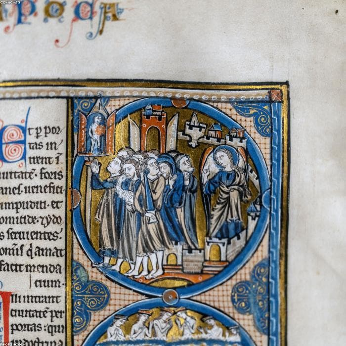
Look first at the gold. Burnished gold leaf, laid over a raised gesso ground and polished to a mirror, catches light in a way that paint cannot imitate; it is the surest sign of quality and of an unrestored surface. Where gold is applied flat as a powder — shell gold, brushed on — the effect is quieter, and the difference tells you something about both the commission and its cost.
The light in the gold
Raised and burnished gold is the first thing a forger or a tired restorer gets wrong. Genuine leaf sits proud of the page, its edges crisp, its surface faintly undulating where the gesso cushion beneath it has aged. Tilt the leaf and it should flash like metal, not glow like paint. Small losses that reveal the reddish bole or white ground beneath are not flaws so much as evidence — the honest wear of six centuries.
How the gold is handled also speaks of ambition. Lavish, tooled grounds with punched patterns belong to costly commissions; sparing use suggests a humbler one. Before a single pigment is considered, the gold has already begun to place the leaf.
What the colours confess
The deep, even blue of true lapis lazuli — ground from stone carried halfway across the world — speaks to both the period and the means of whoever commissioned the book. Ultramarine was, for centuries, costlier than gold, and its presence in quantity is a statement. Azurite gives a greener, cheaper blue; the choice between them is as much economic as aesthetic.
The other pigments tell their own tale: vermilion and red lead for warmth, verdigris for a green that can bite into the vellum over time, lead white for highlights and flesh. Strong, unfaded colour on supple vellum is the combination collectors wait for, because it survives only where a leaf has been kept from light and damp through every century since.
Ultramarine was dearer than gold. Where a painter spent it freely, someone of consequence was paying.
Script, ruling and hierarchy
The text is not mere background. The formal gothic bookhand — littera textualis — is ruled to an exacting grid, and the ruling itself, in lead or faint ink, can help date and localise a leaf. Look at how the scribe managed the line-endings, where abbreviations fall, and how evenly the colour of the ink holds across the page.
Decoration follows a strict hierarchy. The largest, gold-grounded initials mark the most important divisions; smaller initials, line-fillers and rubricated headings step down in importance. Reading that hierarchy tells you where you are in the book and how richly the whole was conceived — a single leaf carries the logic of the entire volume.
Borders, beasts and marginalia
The margins are where the medieval imagination ran freest. Bar-and-ivy borders, sprays of acanthus, and the small painted beasts and hybrids known as drolleries animate the edges of the finest pages. Their style and density help with attribution as surely as the miniatures, since border-work was often the signature of a particular workshop.
Marginalia repay close attention for another reason: they are frequently where later hands and modern retouching betray themselves, the brushwork a shade too confident, the palette subtly wrong. The edge of the page is often where the truth of a leaf is decided.
A leaf keeps its secrets in the margins — where later hands forget to be careful.
The vellum itself
Turn to the support. Vellum has two faces — the smoother, paler flesh side and the slightly darker hair side, sometimes still showing faint follicle patterns — and a well-made book was assembled so that like faced like across an opening. The preparation, thickness and translucency of the skin all speak of the quality of the workshop.
Condition lives here too. Cockling from damp, offsetting where a facing page has transferred its image, flaking of pigment from a stiff or abraded surface, and margins trimmed in a later rebinding are the things to weigh. A leaf can be beautiful and still tell you, plainly, how gently or roughly it has been treated.
A window, not a fragment
Read closely enough and the leaf stops being a fragment and becomes a window — into a workshop, a patron, and a way of seeing the world. The gold was meant to carry candlelight; the blue to honour a figure; the script to be murmured rather than merely read. To hold the leaf is to stand, briefly, where its first owner once stood.
That is the quiet argument for collecting them with knowledge rather than mere appetite. The more you can read in a single leaf, the more completely it gives itself to you — and the more securely you can vouch for it when, in time, it passes to the next pair of hands.
Share